FARMERS BUSINESS NETWORK · PRODUCT & GROWTH
Room to grow.
Making the first step into FBN
feel like an open door.
FBN / SIGN-UP REDESIGN01 → A BETTER FIRST STEP
Real people.
Fewer barriers.+32% sign-ups
Fewer barriers.+32% sign-ups
Sign-up redesign
for company growth.
Farmers Business Network, a $4B AgTech Unicorn, bridges the gap for farmers by providing access to resources, information, and a network of peers to enhance their business and farming practices.
00 / THE OPPORTUNITY
A growing network. A difficult first step.
FBN has over 50,000 active users, but we have seen a slow increase in user numbers during the past fiscal year.
Goal: As the sole designer on the growth team, I collaborated with my product manager to identify opportunities to expand the user base and increase company revenue.
THE STARTING POINT
Ship, learn, refine.
Our strategy is to ship the product/feature as soon as possible to gather feedback from the market directly.
We continuously refined shipped features based on real user data to improve both user experience and business performance.
FROM SIGNAL TO IMPACTThe growth team’s workflow
Discovery
- Growth Signal
- Explore
- Build
- Ship
Continuous Learning
- Learn
- Iterate
- Impact
REPORTED BUSINESS IMPACT
01 / SIGN-UP REDESIGN
Less friction. More belonging.
I have received a request from my product manager to improve our existing signup experience in order to increase the number of sign-ups.
Currently, less than 50% of users can complete the entire process.
BEFORE · THE ORIGINAL JOURNEY
Why would this happen?
01 / 03
Three screens before getting started.
Our previous sign-up process involved three separate screens:
a sign-up form, a Know Your Customer section, and a terms and conditions agreement.
02 / 03
Questions users struggled to answer.
The process wasn’t user-friendly, many users struggled to understand the questions we asked.
As a result, we experienced a 50% drop-off rate at the second screen.
50% drop-off at screen two
03 / 03
An outdated final step.
The design language used for signup is outdated.
FBN haven’t updated the sign-up page for three years!
Less than 40% completion
01 / 03
BEFORE · DIAGNOSE THE DETAILS
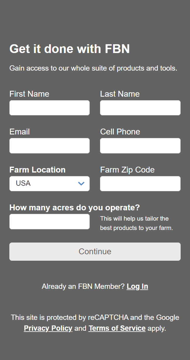
Four points of friction.
01 / 04
A headline without a reason to join.
The “get it done” statement provides no valuable information to users and fails to clearly convey the benefits of signing up.
02 / 04
Give each input room to breathe.
Combining the Email and Cell Phone text fields into one row complicates the process for users to accurately check their inputs.
03 / 04
Ask the right question at the right time.
The sign-up process includes various reasons for sign-up, such as Community Builder and Agronomist.
Asking about the number of acres they operate on the first screen does not align with the purpose and is unnecessary.
04 / 04
Make the commitment clear.
Users are not aware of the remaining steps when they encounter the "Continue" button, which may discourage them from completing the sign-up process.
01 / 04
After conducting research and consulting with my product manager, we concluded that the sign-up process is the starting point for users and a critical factor in boosting sign-up rates.
FBN is a complex platform and owns multiple verticals, including Shop, Loan, Insurance, Data analytics, and a Farmers' community, and we aim to create an inclusive sign-up experience for our users.
To address the issues, we aimed to simplify the process by merging the steps and implementing a new, consistent design language that aligns with our design system.
AFTER · REDESIGN THE FIRST SCREEN
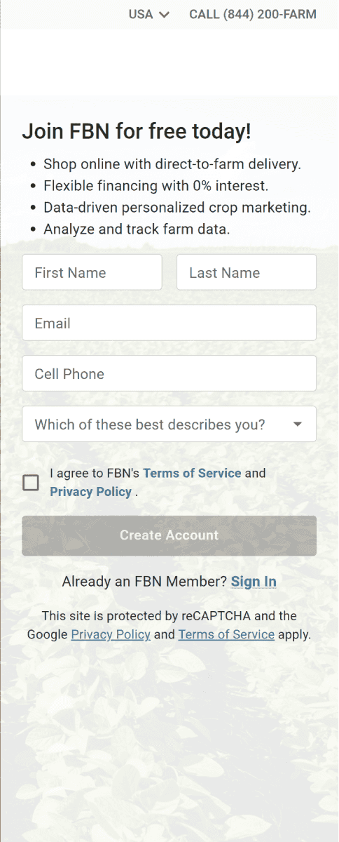
A clearer invitation to join.
01 / 04
Show the value of membership.
Educate users on the benefits of signing up, increasing motivation to complete the process.
02 / 04
One field. One line.
Make it easier for users to check and correct any mistakes in their entries quickly.
03 / 04
Start with what matters.
Removing the number of acres and farm geolocation questions from the first screen.
04 / 04
From “Continue” to “Create Account.”
Communicate that the sign-up process is streamlined into a single step.
01 / 04
AFTER · FARMER & LIVESTOCK PRODUCER
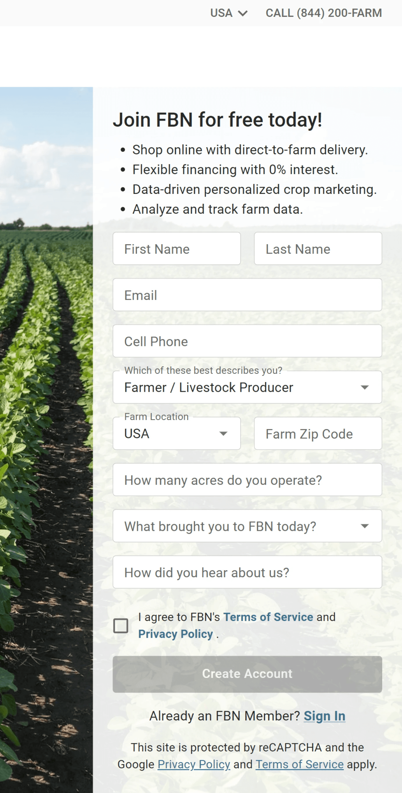
One frame. Relevant questions.
01 / 03
A flow that adapts to the member.
Consolidated the multi-step sign-up process into a single frame, with a dynamic display of Know Your Customer questions based on user selection.
02 / 03
Basic information first. Farm details next.
Placing the number of acres and farm geolocation questions as subsequent questions when users select "Farm/Livestock Producer."
03 / 03
Make privacy part of the experience.
Implemented a T&C checkbox into the sign-up form, linked to the company's privacy policy.
Communicate the commitment not to sell their information and use it solely for providing value to them.
01 / 03
AFTER · OTHER MEMBER TYPES
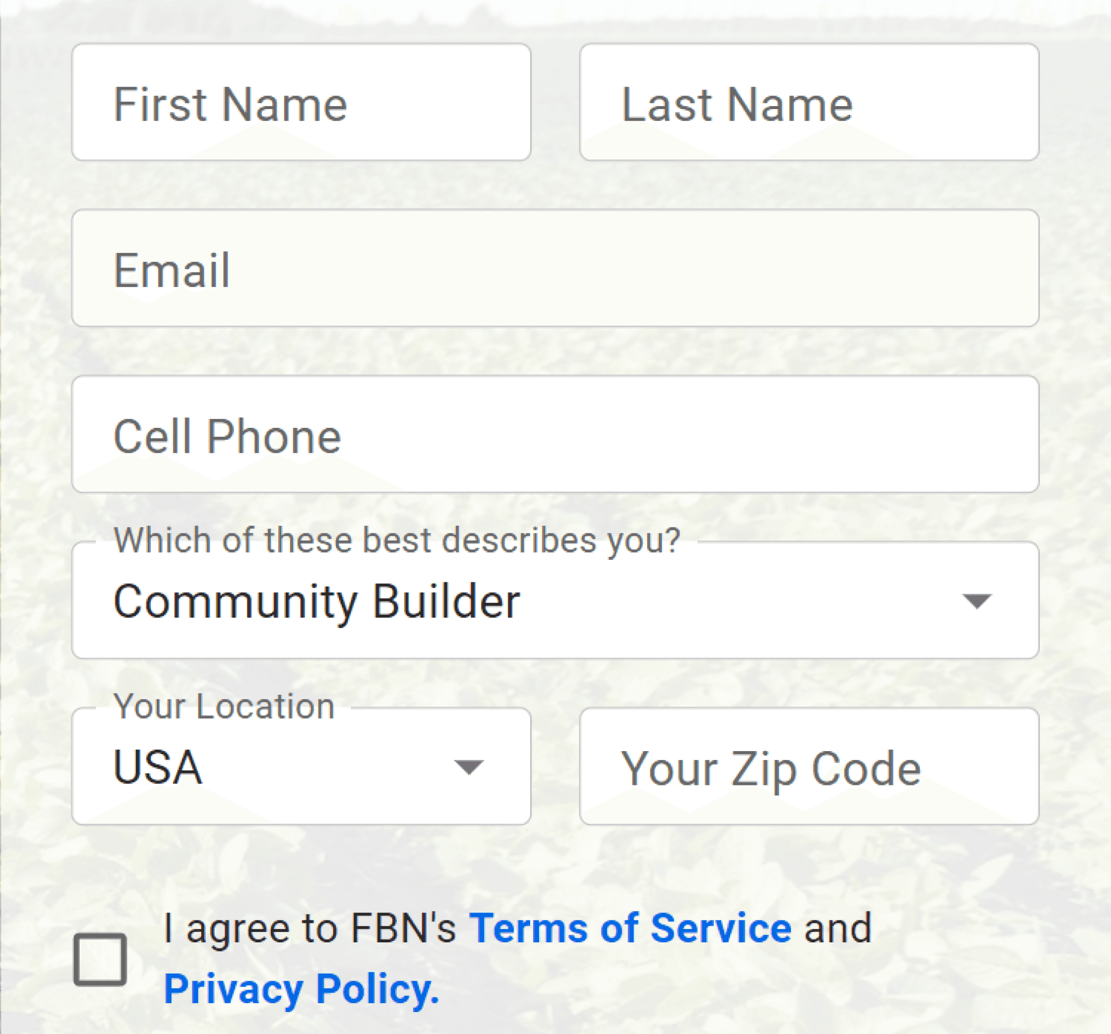
A place for every member.
01 / 02
Make the form approachable for non-farmers.
Changed “Farm Location” and ”Farm Zip Code” to “Your Location” and “Your Zip Code”
02 / 02
Reduce the cognitive load.
Removing subsequent questions for users who select options outside of “Farmer and Livestock Producer”
Eliminating questions that are not relevant to specific user types.
01 / 02
02 / MOBILE EXPERIENCE
Every pixel has a purpose.
To ensure ease of access, we optimized the sign-up form for mobile devices, limiting its height to 700px or less.
Research showed that 80% of users log in to our website via mobile, so the CTA for sign-up should be visible without scrolling.
Ensuring sitewide design consistency was a complex process that involved collaboration with the design system manager and legal team. I worked on adjusting the padding and content copy to meet the design requirements. The final result was marketing content limited to a width of 343px (one line of content) and a legal exemption limited to a height of 42px.
BEFORE → AFTER
Make the final action easier to reach.
Reduce the vertical footprint of the form so the next action is easier to find on mobile.
The original mobile form
A long form with limited vertical space.
A more compact mobile layout
Reworked spacing, marketing copy, and legal content.
BEFORE → AFTER
Bring sign-up out of the menu.
The key change: a persistent, visible sign-up action in the mobile header.
An extra step to find sign-up
The entry point lived inside navigation.
See the original homepage
Visible from the first screen
Sign-up is promoted into the top navigation.
3 Weeks Design Project, Resulted In
SIGN-UP REDESIGN · REPORTED RESULTS
03 / ACROSS THE PLATFORM
One system. More ways in.
As a versatile platform that goes beyond e-commerce, we have multiple places to encourage users to sign-up.
Based on the success of our Main Sign-up Flow, we decided to implement similar changes to our Shop Sign-up and Community Sign-up processes, ensuring a consistent and optimized sign-up experience across all areas of our site.
Meet people where they already are.
Shop Signup Mobile Optimization
Overhauled the design language for the application to the newest design system, resulting in improved usability and making it easier for developers to maintain.
Increased the efficiency and usability of the shop's sign-up process by eliminating the "Reason for Sign Up" questions, resulting in a smoother and more streamlined experience for users.
Keep the community within reach.
Community Signup Mobile Optimization
Reorganized marketing content into two parts and positioned the first part above the sign-up form, which improved user engagement by emphasizing the value of sign-up.
Improved community sign-up flow by removing the 'Reason for Sign Up' question, enabling users to browse the forum quickly.
BEFORE → AFTER
A shorter path from shopping to joining.
Updated the design language, separated contact fields, and removed the redundant reason-for-sign-up question.
A denser first step
Paired contact fields and a “Continue” action lead into the old flow.
See the original shop entry
A clearer, adaptive form
Separate contact fields. Relevant questions. A clear account-creation action.
AFTER / ONE CONTINUOUS FORM
Lead with value. Finish with confidence.
Membership benefits introduce the form; supporting proof reinforces the value near completion.
Community sign-up
01 · Benefits and introduction
04 / GROWTH EXPERIMENT
Turn curiosity into connection.
While the blog attracts a growing audience and highlights diverse farmer perspectives, it has not translated into meaningful revenue impact.
Our goal was to leverage existing system components to design a low-lift experiment that either guides readers toward the online store or increases user sign-ups.
Invite readers to join
Combining it with a tested sign-up flow, we can make the sign-up more prominent to drive users to the sign up page.
This should be easy to implement as we have multiple components available in the system.
Connect readers to the store
We do not have enough articles that feature our products
Our current system only has card carousel components available, but modifying them to meet our needs would be time-consuming and difficult to maintain.
Borrow the pattern. Fit the system.
After conducting research on several consumer-based platforms, I identified the best method to drive users to sign up.
Based on similarities of the user behavior with other platforms, I decided to create a sign-up tray feature inspired by Master Class and The New York Times.
An invitation at the right moment.
To drive more user engagement, I redesigned the existing component in our design system and created a new sign-up tray feature for the FBN Blog.
The design of this feature was inspired by The New York Times, but it was customized to meet the specific needs of our audience.
The tray only appears once users have scrolled 50% down the page, ensuring that it doesn't interrupt the reading experience.
Compact enough to keep reading.
The sign-up tray is designed to take minimal space on both desktop and mobile devices, with only 76px in height on the desktop and 150px on mobile. This ensures that the tray is unobtrusive and does not interfere with the user's reading experience.
After 1 week Launch…
BLOG EXPERIMENT · REPORTED RESULTS
05 / REFLECTION
Designing for growth, together.
Work with the system.
My objective was to utilize the pre-existing components in the design system for efficient design outcomes; however, choosing the appropriate component was a challenge as each component has its own underlying logic and code.
To make the correct choice, I had to regularly review MUI.com and collaborate with my design system manager for permission to modify components and templates.
I usually present multiple options for consideration by both the DSM and PM, and I need to ensure my design is aligned with our standard to publish in our design system for future use.
Additionally, the growth team does not have internal engineers. I had to transfer my work to an external engineering company that operates in a different time zone. Due to the time difference and the need for fast product shipment, we sometimes had to omit handoff sessions to ensure timely delivery.
It was essential for me to create comprehensive documentation, such as gherkins and specs, to assist the engineers in understanding the flow, thereby reducing the workload and time spent during the QA session.
I'm committed to improving my workflow and ensuring that I provide clear and concise documentation to assist with the development process. Clear communication and collaboration between designers and engineers are essential for the success of any project, and I'm dedicated to playing my part in this process.
During my time at FBN, I have gained valuable knowledge and experience in design systems and product thinking through hands-on practice. Collaborating with engineers has been challenging, but I am continually refining my skills in creating comprehensive gherkins and design specs to ensure seamless transitions. I recognize that a UX designer's primary goal is to prioritize the needs of the user, however, I also must keep business requirements in mind when designing a product.
I‘ll never forget my design manager's words, “I taught you to be a designer, but good is defined by experience.” I am dedicated to pursuing my dream of becoming an excellent designer.