

Freeman Tools E-Commerce Redesign:
Building a High-Conversion DTC Experience
Freeman Tools is a jobsite-tested tool brand offering high-quality pneumatic and cordless solutions for construction and home improvement.
My Role: Product Designer, Product Manager
Tools: Shopify, Figma

Overview
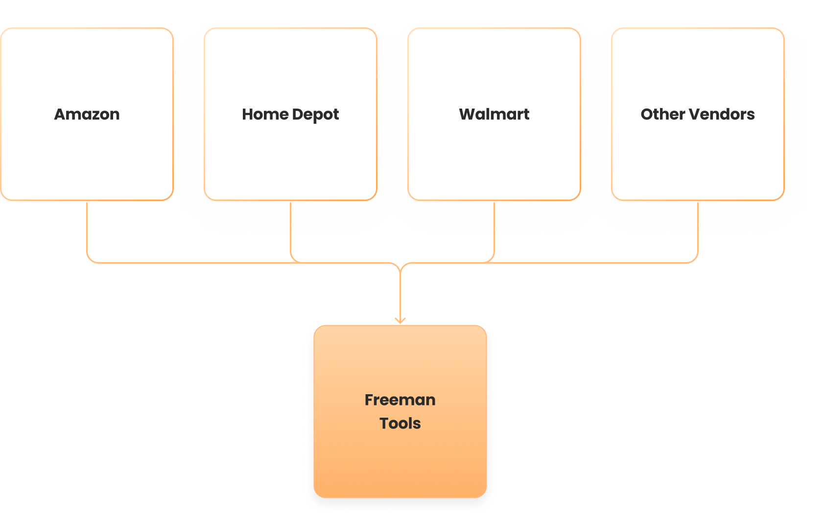
FreemanTools.com was never built as a real sales channel. Most revenue came from Home Depot, Amazon, and Walmart—but low buying prices and high Amazon fees made DTC growth essential.
The site couldn’t support this shift: traffic was low, navigation was unclear, product info was inconsistent, and customers struggled to find the right tools or fasteners. Returning-customer rates were also dropping, showing weak retention.
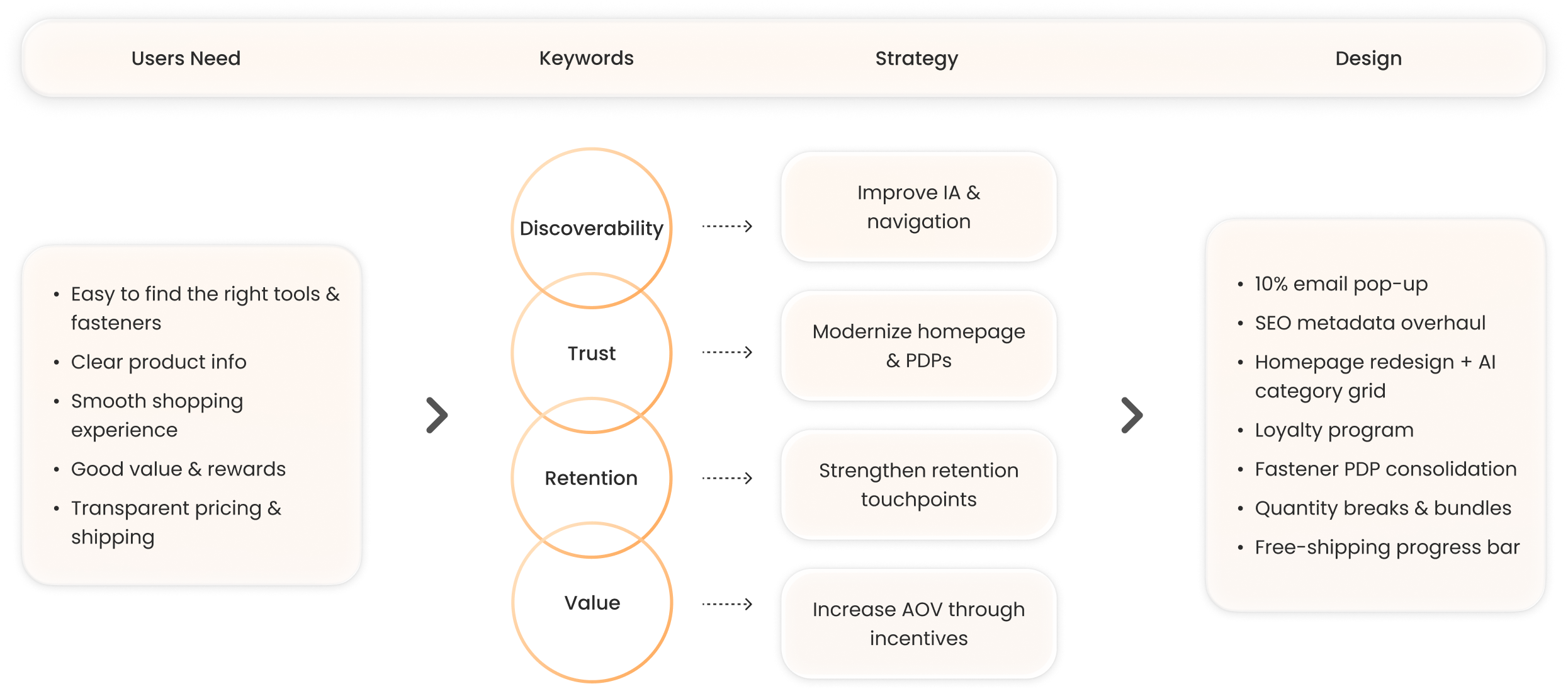
How might we redesign the site to improve discoverability, build trust, and create a sustainable DTC engine for Freeman?
Project Goals
Build a sustainable DTC channel that supports healthier margins compared to retail partners and Amazon Seller Central.
Increase conversion rate by improving navigation, product hierarchy, mobile experience, and PDP clarity.
Improve customer retention by making it easier for past buyers to find compatible tools, refill fasteners, and discover new products.
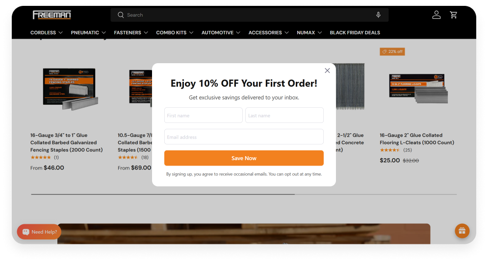
Task 1: Email Capture Upgrade: Adding an Incentivized Pop-Up
The previous site only had a passive footer email field with no incentive, which resulted in very low sign-up volume.
Took up a large portion of the homepage, pushing key content (navigation, product discovery) further down and reducing screen efficiency.
Low information density, a lot of visual space was used without delivering meaningful value or clear CTAs.
Poor hierarchy, the section felt visually heavy without aligning to user goals or business priorities.
Not mobile-optimized, making it even more space-consuming and less actionable on smaller screens.

To help grow our DTC channel and improve retention, I introduced a new 10% off opt-in pop-up.
My first version triggered after 5 seconds, but user behavior quickly showed that it disrupted early browsing.
I iterated on the timing and increased the delay to 15 seconds, giving users more time to build trust before being asked to subscribe.
Result (Past 6 Months and Past 30 days)
Past 6 Months Data

The past 30 days show strong momentum
a 2.37% conversion rate, surpassing the lifetime average and trending upward month-over-month.

Task 2: SEO Metadata Overhaul for All Product & Collection Pages
Before the redesign, most product and collection pages had missing or extremely minimal metadata (e.g., “Hex Keys”), which hurt search visibility and click-through rates.
I audited every listing and collection and rewrote titles and meta descriptions to follow SEO best practices: clear keywords, product intent, and use-case-driven descriptions.

Previous

New

Result

Task 3: Homepage Redesign + AI-Generated Responsive Category Grid (View Live)
The previous homepage lacked visual hierarchy and relied on a simple, repetitive “Shop by Job” row that didn’t scale across devices or reflect the full product ecosystem.
Previous Design

I redesigned the homepage to improve navigation, strengthen trust signals, and introduce richer content sections.
PS: The “Add to Cart” button appearing in the screenshot is a hover-only interaction on the live site. It shows up here due to screenshot limitations, but it’s not visible to users unless they hover over a product :)

I built a new responsive category grid using AI-generated components to improve discoverability and engagement.
To replace the outdated “Shop by Job” row, I created a fully responsive category grid that highlights key product families and makes it easier for users to browse by job type.
I wrote detailed, structured prompts for Shopify’s AI component generator, allowing me to produce a reusable, scalable section that adapts seamlessly across desktop and mobile.
AI automation made it possible to rapidly iterate on layout, spacing, and hover states, resulting in a cleaner, more modern browsing experience.

I designed this section to introduce stronger trust signals and SEO-optimized content:
Including pro features, expert articles, and verified reviews.
This helps users feel confident in the product while also improving search visibility and overall discoverability.

Task 4: Launching a Loyalty Program from Scratch (View Live)
To strengthen customer retention and encourage repeat purchases on our DTC site, I explored ways to build ongoing value for users beyond discounts alone.
I’m continuing to refine per tiers and improve the experience design to make the loyalty program more engaging, intuitive, and rewarding for tool buyers.

I have identified retention opportunities and defined a reward structure that incentivizes meaningful customer actions (sign-up, purchases, referrals, reviews).

I built the loyalty system from scratch using a rewards platform, configuring points, discounts, and entry rewards.
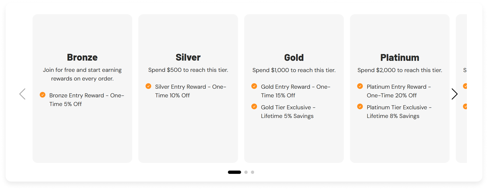
I also designed the membership pop-up and loyalty dashboard UI, ensuring clear hierarchy, intuitive CTAs, and consistent branding.
Pop-up Window
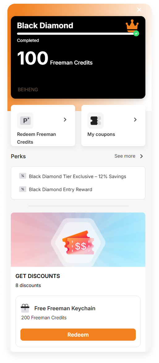
Dashboard UI

Task 5: Fastener PDP Consolidation for Better Navigation & Conversion
Freeman sells more than 200 fastener SKUs, and previously each size, length, and type existed as a separate individual listing.
This created a poor user experience; shoppers had difficulty finding the correct fastener for their tool, and the category pages were overwhelming and repetitive.
By auditing all fastener SKUs and organizing them by gauge, length, finish, and box count, I consolidated related variants into streamlined PDPs, improving product clarity, discoverability, and conversion.
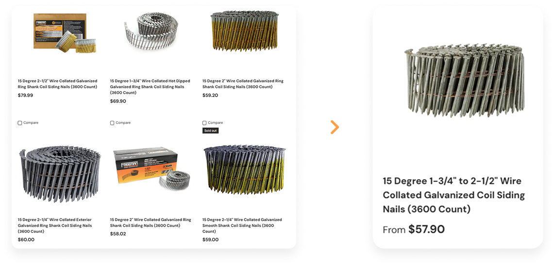
I reorganized dozens of standalone listings into cohesive parent PDPs with variant selection, improving clarity and reducing friction.

Result - For Business

Result - For Users

Task 6: Quantity Breaks & Flexible Bundles to Increase AOV and Conversion
Once 200+ fastener listings were consolidated into variant-driven PDPs, I could finally introduce scalable quantity breaks and bundles, which weren’t feasible when each size lived as an individual product.
Quantity Breaks (Bulk Discounts)
With fasteners now organized into single product families, I designed a new tiered pricing system:
1 Box (standard price), 5 Boxes (5% off), 10 Boxes (11% off)

Flexible Nail Gun Bundles
Because fastener variations were finally unified, I could now build dynamic, customizable bundles between nailers and the correct fasteners.
For example:
A fencing stapler + user-selected staple length
Automatically calculated bundle price
Clear comparison against original total price

Bundles simplify the buying process for customers who don’t know which fasteners fit their tool.
Helps reduce returns and compatibility issues.
Increases attachment rate (tool + fasteners instead of tool alone).
Result (First 2 Weeks)
Within the first two weeks, bundles generated ~25% of monthly sales, showing strong early demand for project-based purchasing.

Task 7: Free Shipping Progress Bar
With bundles and quantity breaks now driving larger purchases, I strategically increased the free shipping threshold from $35 → $75, with $99 planned as the next step.
To support this transition without hurting conversion, I designed and implemented a free shipping progress bar in the cart.
Added a dynamic progress bar that updates based on the customer’s cart total
Displayed a clear message (“Spend $29 more for free shipping!”) to guide users
Positioned it at the top of the cart where intent is highest

Anchoring: Displaying the remaining amount makes the goal feel achievable.
Motivation: The progress bar encourages users to add another item.
Clarity: Free-shipping rules are obvious, no checkout surprises.
AOV boost: Complements bundles and quantity breaks to increase order size.
Result

Related Projects
Overview - Wiki Keebs
Wiki Keebs is a passion project aimed at helping mechanical keyboard enthusiasts find their perfect build. I led the UX/UI design for the entire site, focusing on clarity, searchability, and affiliate-driven monetization.
The goal was to combine product discovery with a streamlined user experience that catered to both beginners and experts.
Challenges
Users often found it hard to compare switches, keycaps, and keyboard layouts across vendors.
There was no centralized tool for exploring builds based on typing feel, layout, and aesthetics.
As a small team (just myself and a developer), we had to prioritize MVP functionality while building for scalability.
Solution/Result

Designed a clean, filterable database to help users explore by keyboard layout, switch type, and keycap profiles.
Built a keyboard simulator to preview layouts, sounds, and keycap styles in real time.
Streamlined the UX with fast navigation and a minimalist UI.
Drove traffic with SEO-optimized content and strong community engagement.
Results: 14K+ user events and 568 monthly active users at peak.
Overview - PGP.com
I led the complete redesign of the Prime Global Products (PGP) website using Framer, a no-code platform.
The goal was to modernize the brand presence, highlight B2B services like wholesale and OEM, and support conversion from web traffic to business inquiries—all while maintaining speed and flexibility for internal updates.
Challenges
Outdated site design and structure failed to reflect the company’s capabilities in manufacturing, global sourcing, and distribution.
No clear pathways for wholesale, OEM, or distributor onboarding.
Needed a fast turnaround with limited developer involvement.
Stakeholder input (from the president and business director) required frequent design alignment.
Solution/Result
Designed and launched a new site entirely in Framer, enabling fast iteration and real-time stakeholder feedback.
Created modular landing sections for wholesale, OEM, and drop ship services.
Improved site hierarchy, CTA clarity, and mobile responsiveness.
Result: +30% increase in page views post-launch and stronger B2B engagement through clearer messaging and navigation.
