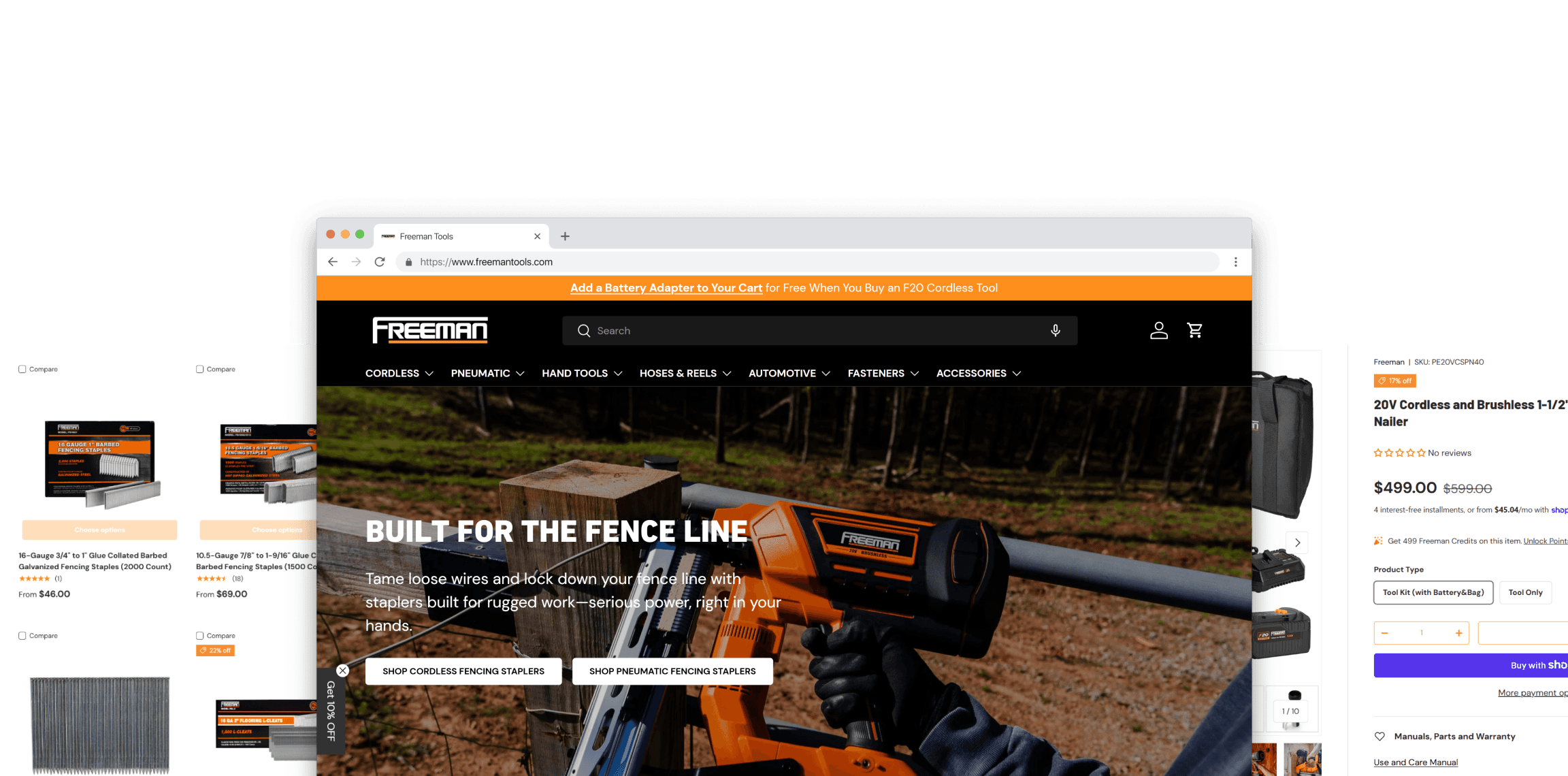
Freeman Tools
Freeman Tools is a jobsite-tested power tool brand generating $15M+ in annual revenue across retail and direct channels.
My Role: Product Designer, Product Manager
Tools: Shopify, Figma, ChatGPT
Problem
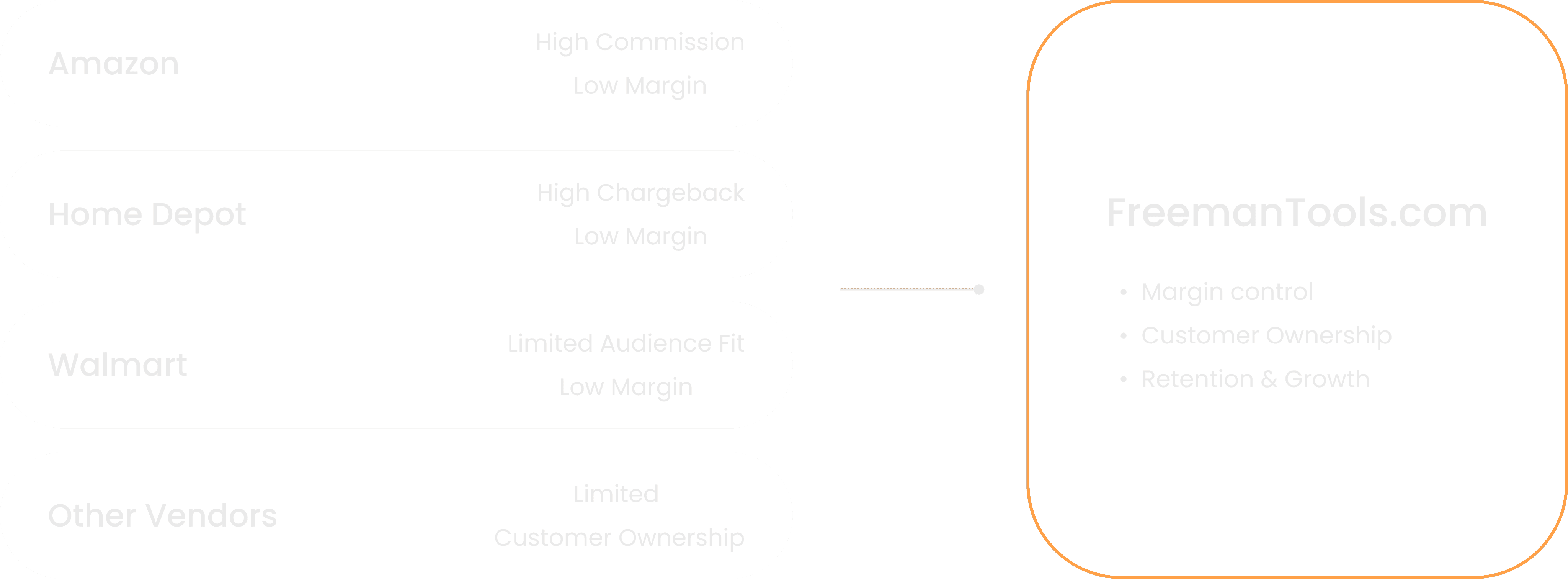
FreemanTools.com was never built as a real sales channel. Most revenue came from Home Depot, Amazon, and Walmart, but low buying prices and high Amazon fees made DTC growth essential.
The site couldn’t support this shift: traffic was low, navigation was unclear, product info was inconsistent, and customers struggled to find the right tools or fasteners. Returning-customer rates were also dropping, showing weak retention.
Opportunity

How might we redesign FreemanTools.com to improve product discoverability, build customer trust, and transform the site into a sustainable direct-to-consumer growth engine?
Goals & Success Metrics
Establish FreemanTools.com as a sustainable DTC channel with healthier margins and greater pricing control than retail partners and Amazon Seller Central.
Increase conversion rate by improving navigation, product hierarchy, mobile experience, and PDP clarity.
Improve retention by helping customers easily find compatible tools, refill fasteners, and relevant add-ons for repeat purchase.
Key Hypothesis
If customers can easily understand which tools and fasteners they need, they will feel more confident making a purchase, leading to higher conversion.
If relevant add-ons are shown at the right moments, average order value will increase without needing more traffic.
If customers are encouraged to return after their first purchase, repeat purchase rate will improve over time.
Constraints
No dedicated Product Manager and in-house engineering support.
Limited design and experimentation capacity.
High business risk tied to funnel performance.
This required making deliberate, system-level prioritization decisions, rather than incremental or cosmetic improvements.
Discoverability
Conversion

Part 1: User Acquisition - Acquisition Through Confidence, Not Promotion
Home Page Redesign: building confidence for users
Redesigned the homepage to quickly establish trust, clarify product categories, and guide users toward the right tools from their first interaction.
Previous Design: Homepage Problems
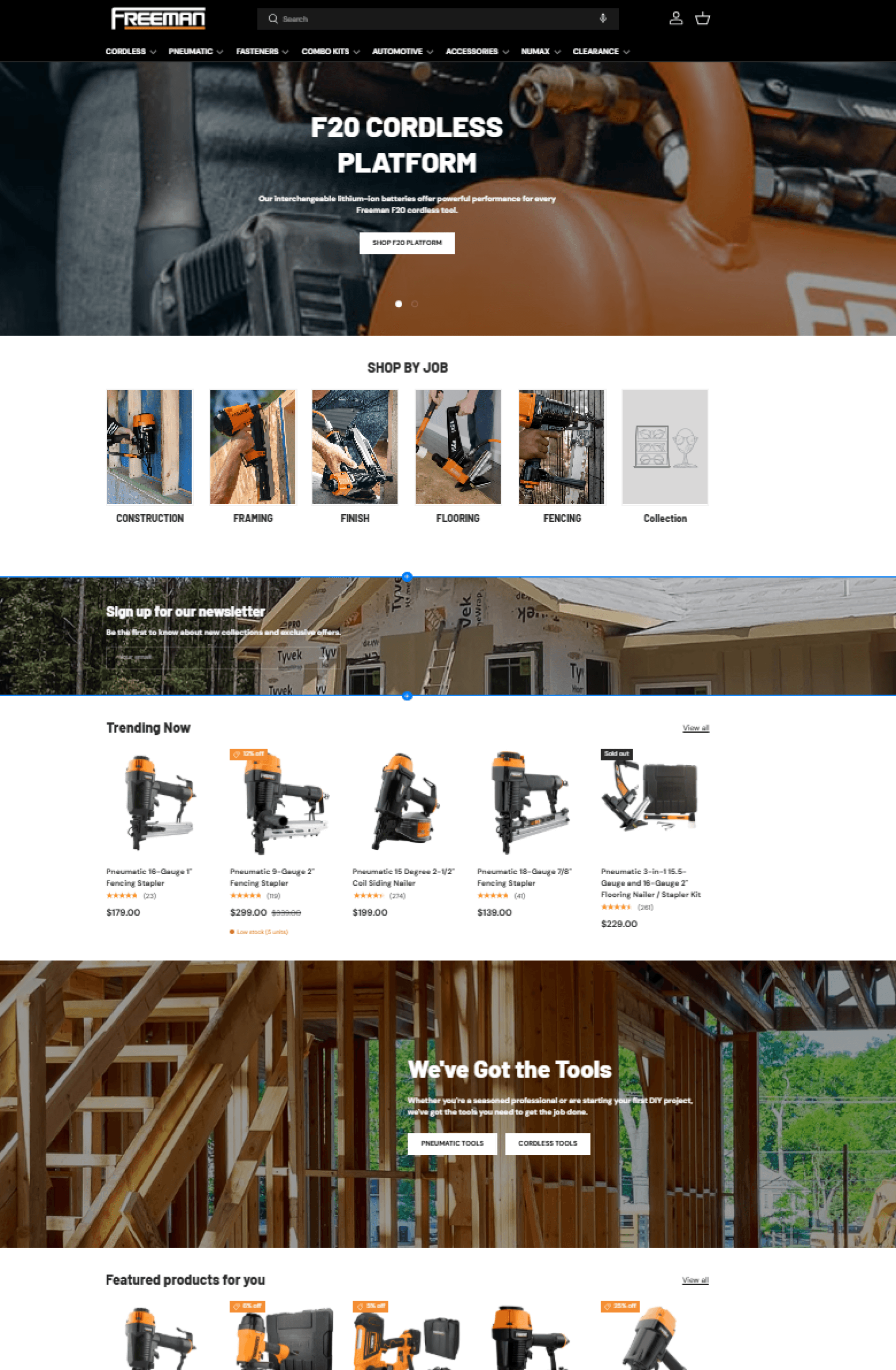
I restructured the homepage into a three-section layout to create clearer user paths, surface richer content, and strengthen trust signals - resulting in a smoother, more confident shopping experience.
I - Scalable Discovery System: Category Grid & Tool Finder (AI-Assisted)
Replaced the outdated “Shop by Job” row with a fully responsive, modern category grid that better surfaces key product families.
Used structured prompts to generate a scalable and reusable Shopify AI component, enabling consistent layouts across desktop and mobile.
Added a guided “Tool Finder” quiz that helps users discover the right tool in under 3 minutes, reducing choice overload and improving engagement (currently iterating to boost completion rate).
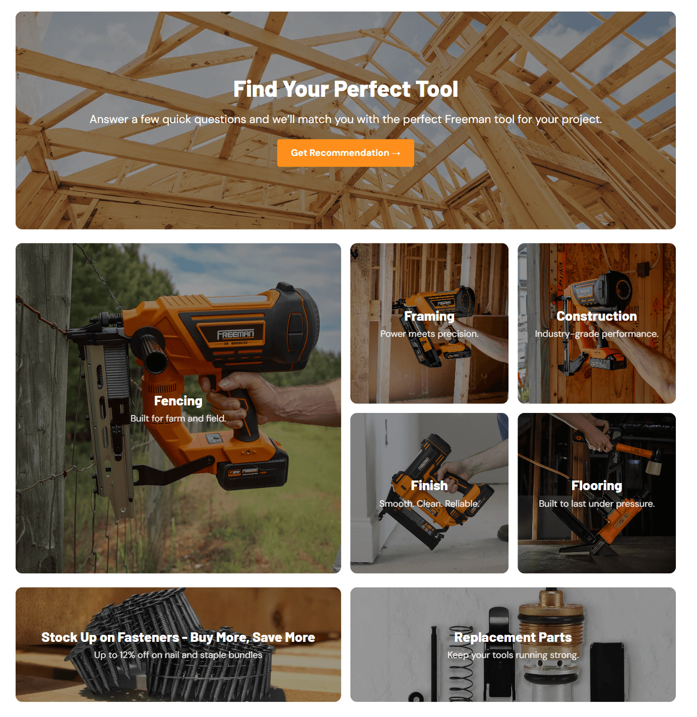
This component is designed for long-term use, not a one-off solution. It includes reusable backend logic that enables the marketing team to manage, iterate, and deploy updates independently in the future.
Further refinements are planned to make this component more accessible for non-designers.
Quiz Section
Media Grid
II - Decision Anchors: Curated Entry Points
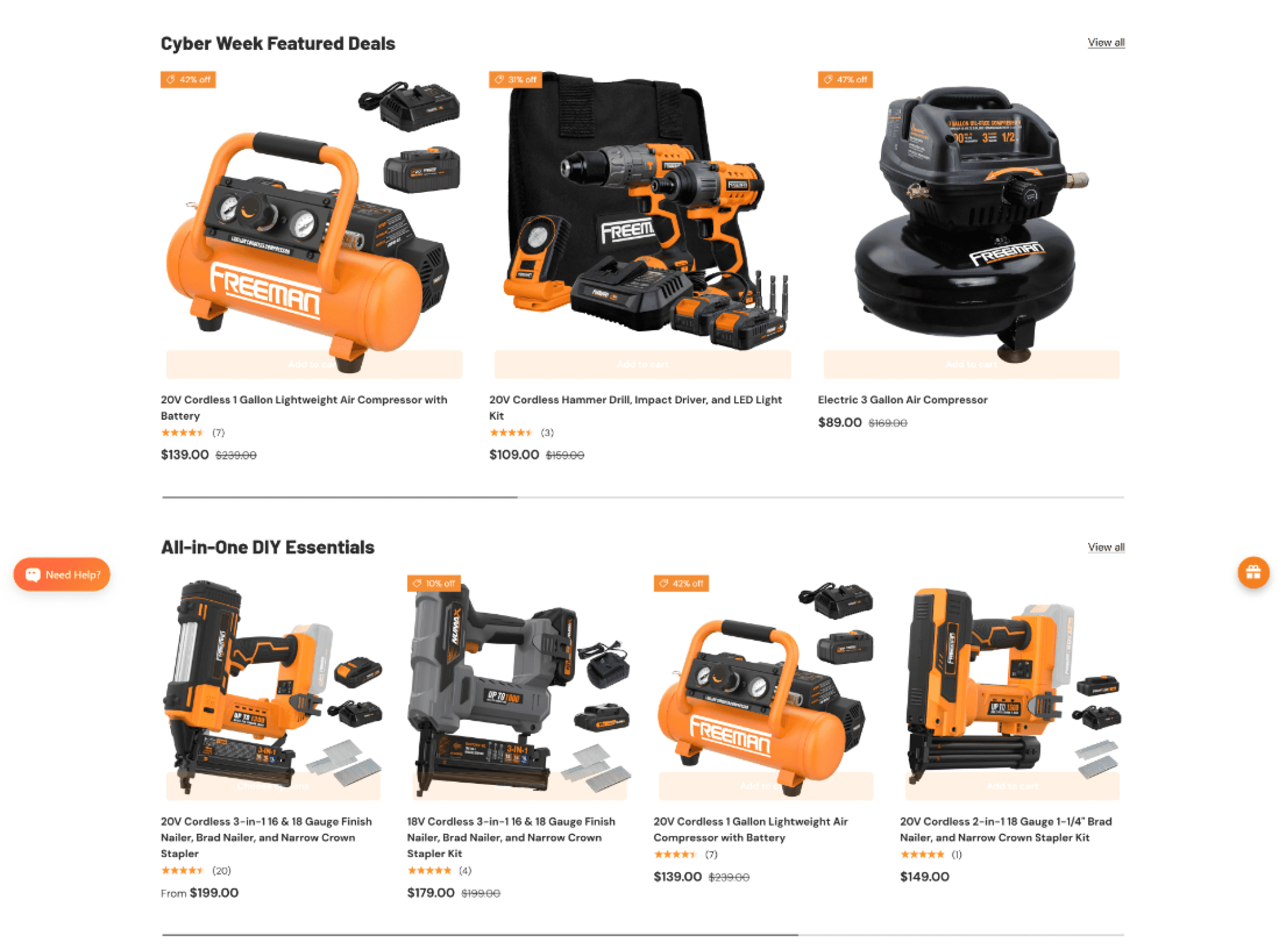
Positioned a dedicated promotional block at the top of the homepage to immediately highlight ongoing deals and high-value kits.
Increased product discoverability by surfacing seasonal promotions and top-selling bundles before users scroll.
Reduced browsing friction by grouping featured items into a single, scannable section instead of scattered rows across the page.
PS: The “Add to Cart” button appearing in the screenshot is a hover-only interaction on the live site. It shows up here due to screenshot limitations, but it’s not visible to users unless they hover over a product :)
III - Decision Reinforcement: Establishing Credibility at the Entry Stage
Designed this section to strengthen credibility through pro endorsements, expert articles, and verified customer reviews.
Curated SEO-optimized content (how-to guides, comparison posts, troubleshooting tips) to boost organic discoverability.
Helps users feel confident in product quality while improving search visibility and overall brand trust.
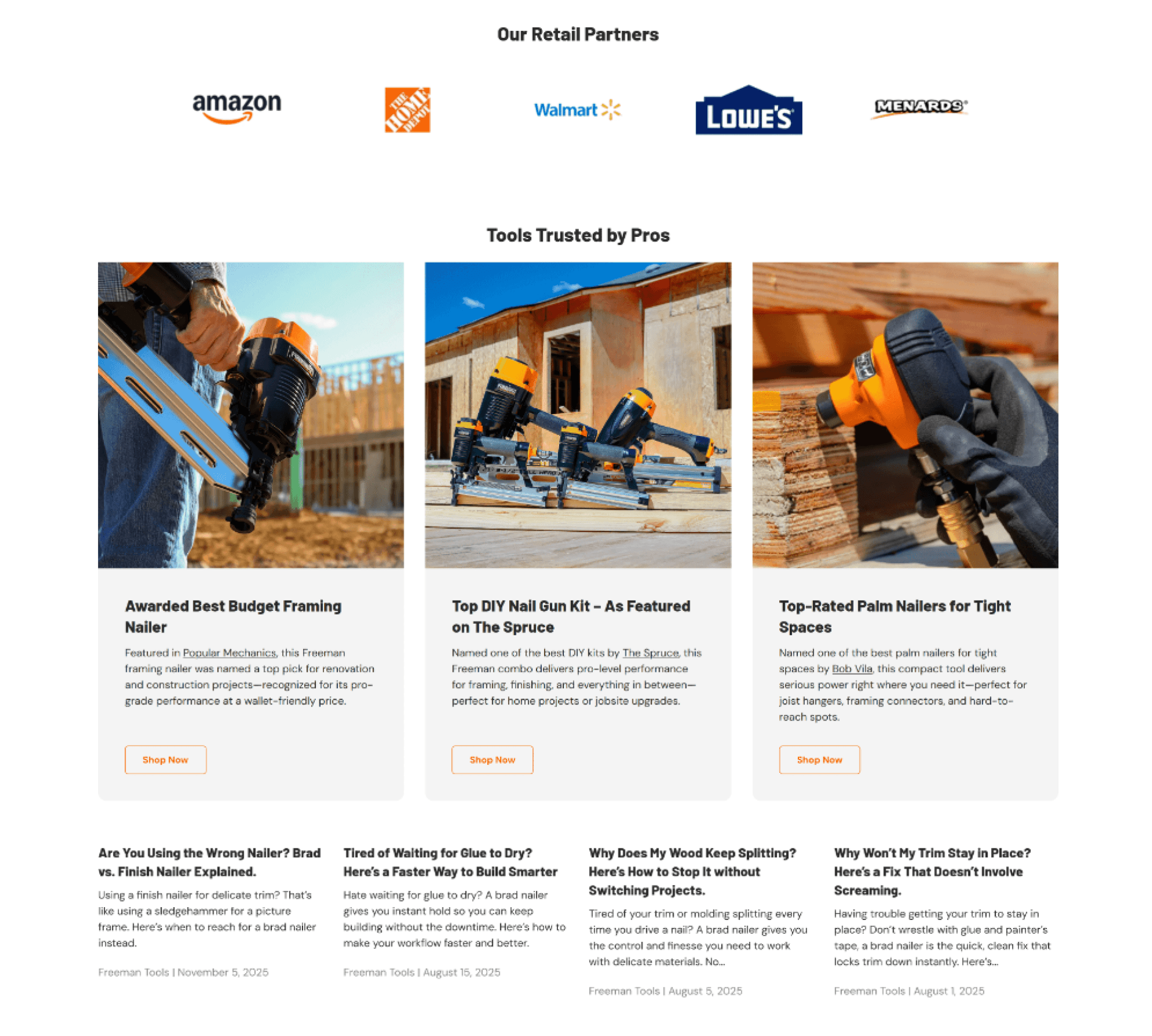
To leverage existing social proof, I imported and centralized reviews from other platforms onto our site.

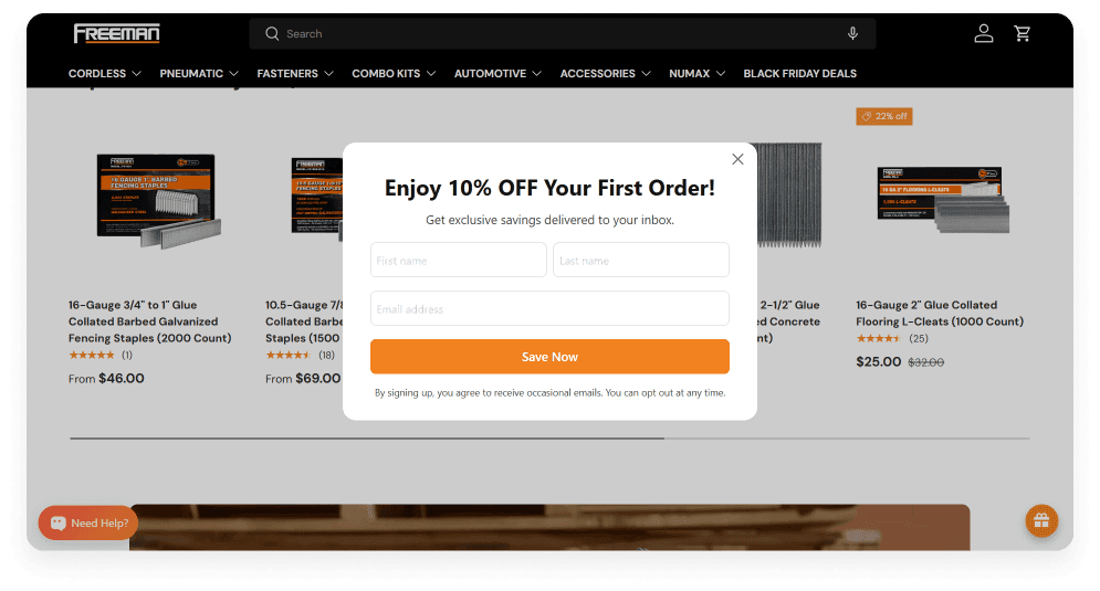
Email Capture Upgrade: Adding an Incentivized Pop-Up and Automated Flow
To help grow our DTC channel and improve retention, I introduced a new 10% off opt-in pop-up.
My first version triggered after 5 seconds, but user behavior quickly showed that it disrupted early browsing.
I iterated on the timing and increased the delay to 15 seconds, giving users more time to build trust before being asked to subscribe.
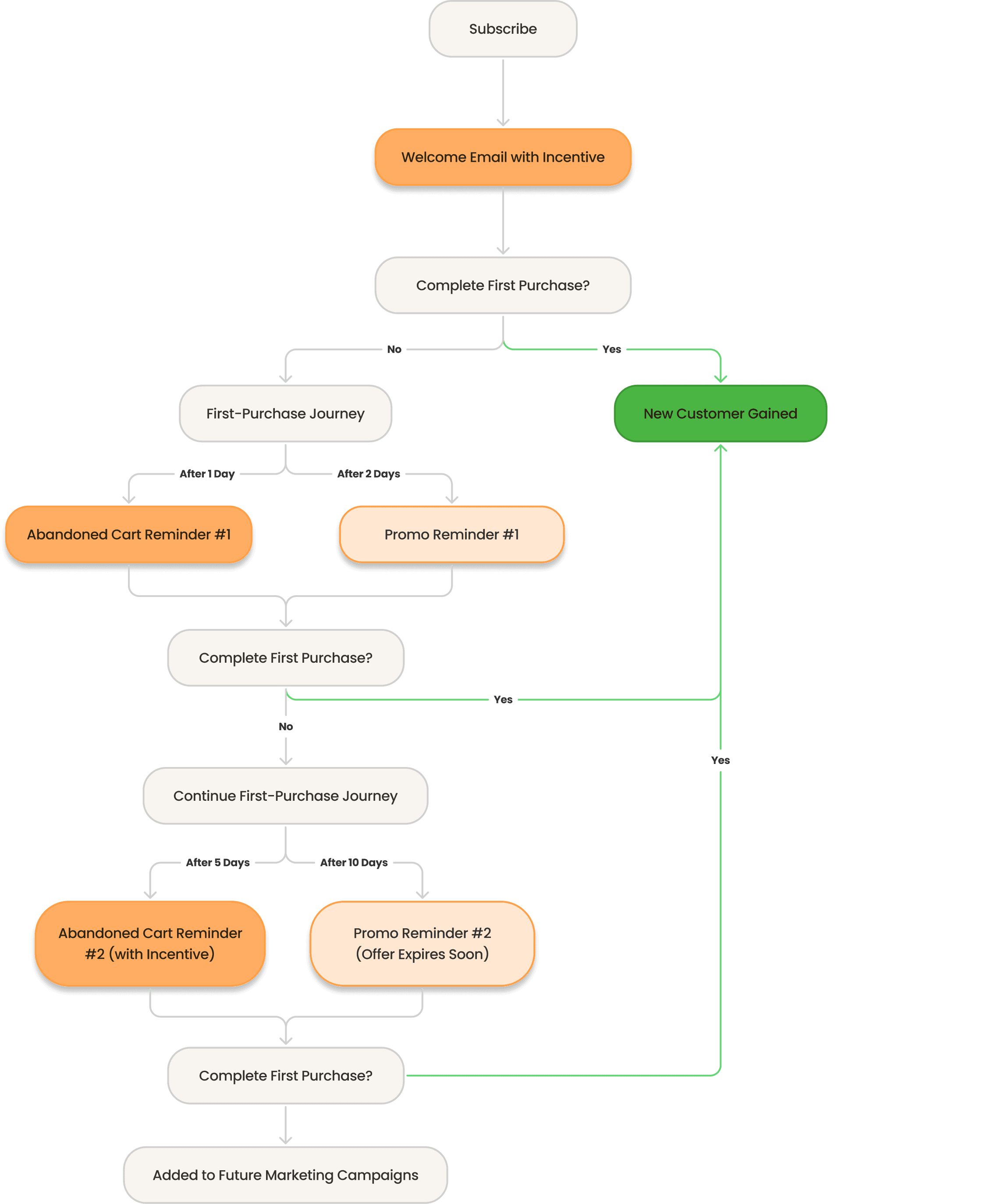
Email Automated Journey
The flow below outlines how subscribers move from signup to their first order through timely reminders and targeted incentives, ensuring we maximize every touchpoint and reduce drop-off.
PS: I’ll continue monitoring performance data and adjusting the timeline to further optimize results.
Result (30 Days Data)
Site Sessions
6186
93%
New Customers
158
100%
Remaining Challenge: Higher Bounce Rate After Homepage Redesign
What happened:
Even after the homepage redesign, overall bounce rate remained higher than expected.
Why this likely happened
Following the redesign, site traffic increased by ~70%. This introduced new traffic cohorts with different intent, expectations, and browsing behavior. As a result, the homepage was no longer serving a single, consistent user mindset.
Signals of Success
Promotional modules drove strong sales performance.
Blog content began generating incremental organic traffic.
These signals suggest that while discovery improved, intent alignment at the homepage level still needs refinement.
Next steps
To better understand user expectations, the next step is to run a targeted survey and segment responses by traffic source and cohort.
This will help identify what different users expect to see first and inform the next iteration of homepage personalization and content hierarchy.
Discoverability
Conversion
AOV

Part 2: User Conversion - Reducing Decision Friction at the Point of Commitment
Simplifying Product Selection Across Tools & Fasteners
To reduce choice overload and improve discoverability, all products were reorganized into clearer, more intuitive structures that helped customers quickly identify the right option for their tool and project.
I - "A+ Content" for Shopify (AI-Assisted)
After a small set of customer interviews, I found that many users bring Amazon-style shopping expectations to our DTC site, specifically relying on rich, visual content to evaluate products before purchasing.
To meet this behavior efficiently, I adapted our existing Amazon A+ assets into a Shopify-native A+ content system, powered by Shopify AI and structured backend attributes.
Front End Design
Designed to help customers make confident decisions
Translates complex product details into scannable, visual explanations
Highlights key features, use cases, and compatibility without overwhelming text
Mirrors familiar Amazon browsing patterns, lowering cognitive load
Internal Flow & System Improvement
This eliminated duplicated work and saved dozens of hours per launch.
Before this system:
Each product required a separate A+ layout or custom listing
Scaling A+ content meant hundreds of duplicated templates
Updates were slow, error-prone, and hard to maintain across SKUs
After:
A single reusable A+ component lives in the main PDP template
I defined and built the backend attribute, so teams only update structured inputs (images, copy) without touching templates.
New products inherit A+ content automatically
Front End Set Up
Back End Set Up
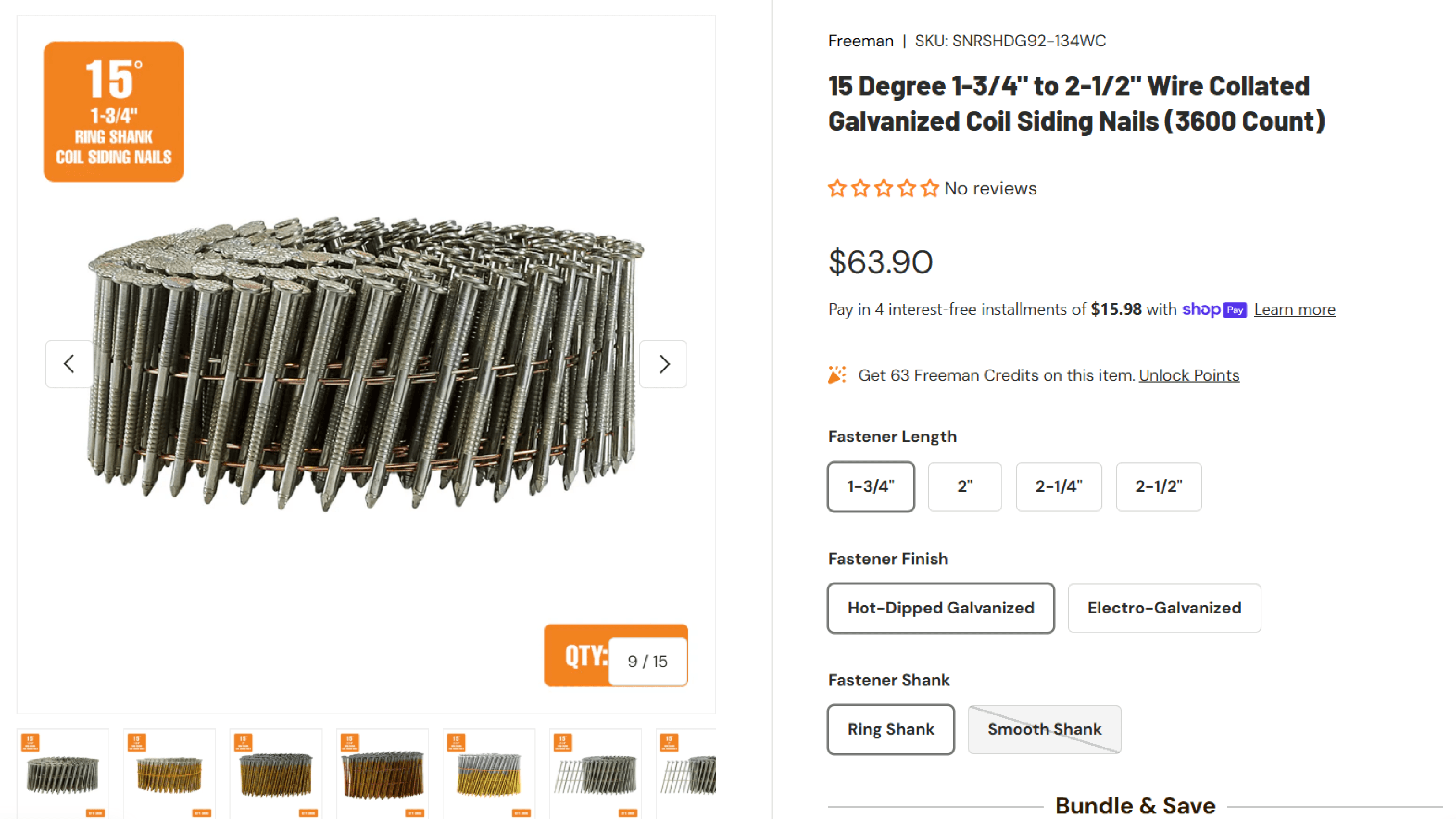
II - Fastener PDP Consolidation for Better Navigation & Conversion
Freeman offers hundreds of fastener SKUs, which previously appeared as separate listings. This made it difficult for customers to find the right option and created overwhelming, repetitive category pages.
To simplify decision-making, related fastener variants were grouped into unified PDPs.
This reduced choice overload, improved discoverability, and made it easier for customers to confidently select the correct fastener, leading to stronger conversion.
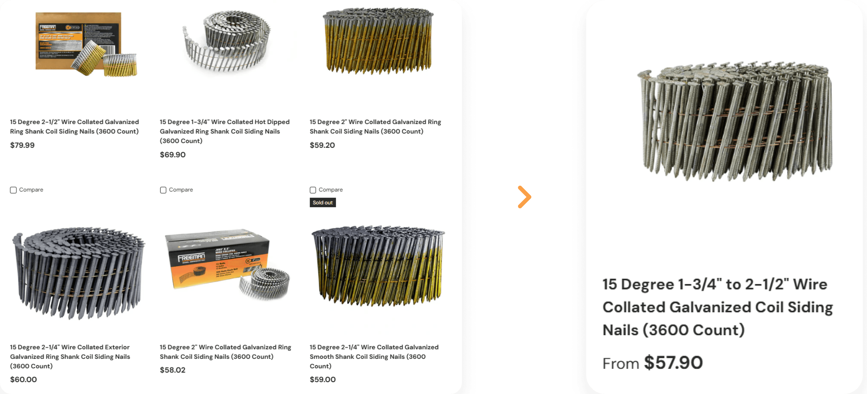
Before: fragmented listings → After: unified, variant-based PDP
I reorganized 150+ fragmented fastener listings into unified, variant-based PDPs to streamline selection and reduce friction.
Consolidated sizes, finishes, and shanks into one organized product family
Improved clarity with intuitive variant buttons instead of separate pages
Reduced decision fatigue and helped users quickly identify the correct fastener
Encouraging Higher-Value Purchases Through Flexible Bundling:
Flexible quantity options and build-your-own bundles helped customers buy the right amount for their projects, making higher-value purchases feel intentional while increasing AOV, trust, and repeat behavior.
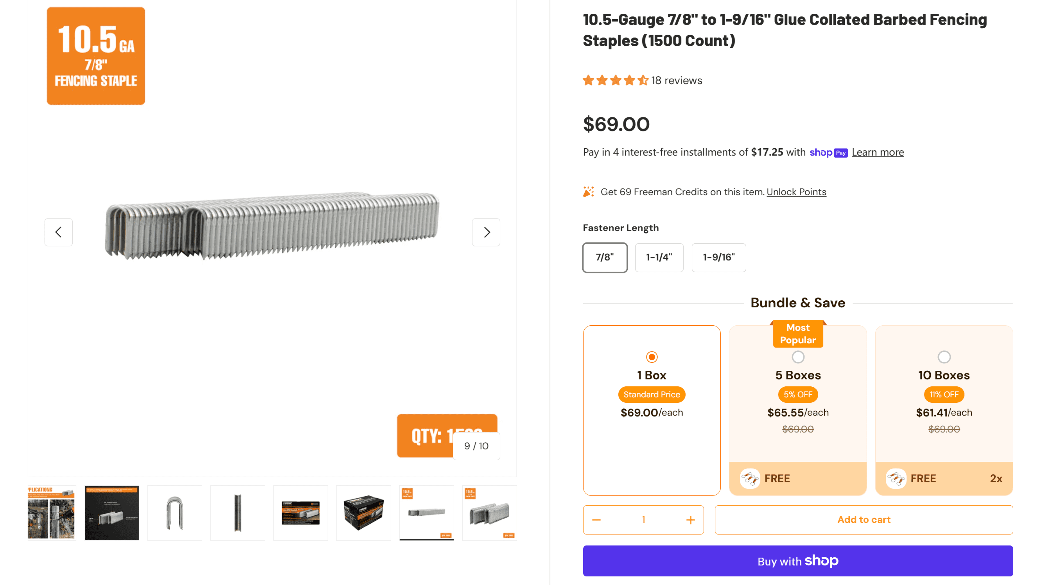
III - Flexible Quantity Options for Larger Orders
Bulk purchasing is common for fasteners, but the previous experience made it difficult to buy the right amount efficiently.
Introducing clear quantity tiers aligned pricing with customer intent, reduced decision friction, and encouraged larger orders, resulting in higher average order value without additional traffic.
IV - Flexible Nail Gun Bundles
Flexible bundles paired tools with compatible fasteners, helping customers buy with confidence while increasing attachment rate and order value.
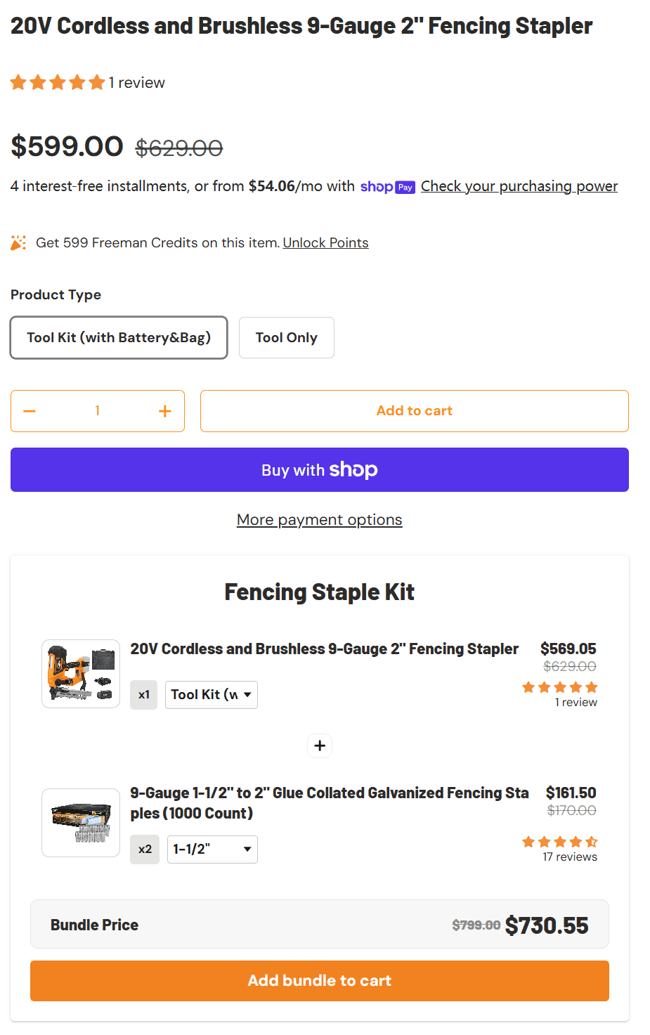
Bundles simplify the buying process for customers who don’t know which fasteners fit their tool
Helps reduce returns and compatibility issues
Increases attachment rate (tool + fasteners instead of tool alone)
V. Free Shipping Progress Bar
With bundles and quantity breaks now driving larger purchases, I strategically increased the free shipping threshold from $35 → $75, with $99 planned as the next step.
To support this transition without hurting conversion, I designed and implemented a free shipping progress bar in the cart.
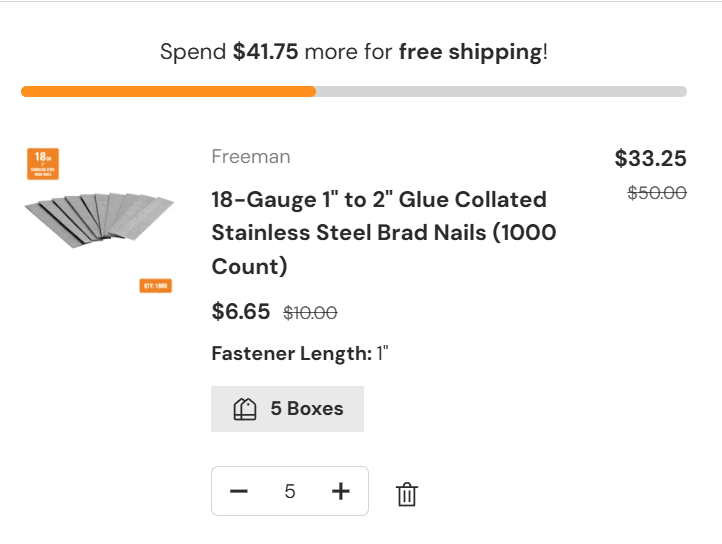
Anchoring: Displaying the remaining amount makes the goal feel achievable.
Motivation: The progress bar encourages users to add another item.
Clarity: Free-shipping rules are obvious, no checkout surprises.
Impact (Long-Term)
For Users
Reduced category clutter significantly, making fasteners easier to browse
Improved product discoverability and user confidence in selecting the correct item.
For Business
Increased conversion rates on consolidated PDPs
Enabled clearer cross-selling and bundling opportunities.
Result (30 Days Data)
Conversion Rate
2.0-3.0%
200%
Average Order Value
$192
82%
Retention
Conversion

Part 3: User Retention - From Conversion to Retention
Loyalty Program
As first-time conversion stabilized, retention became the primary growth lever.
A loyalty program was designed to encourage repeat purchases and strengthen long-term customer relationships on the DTC site.
By rewarding ongoing engagement instead of relying solely on discounts, the program supports retention while creating a more durable value exchange for frequent tool buyers.
the program continues to evolve based on observed customer behavior.
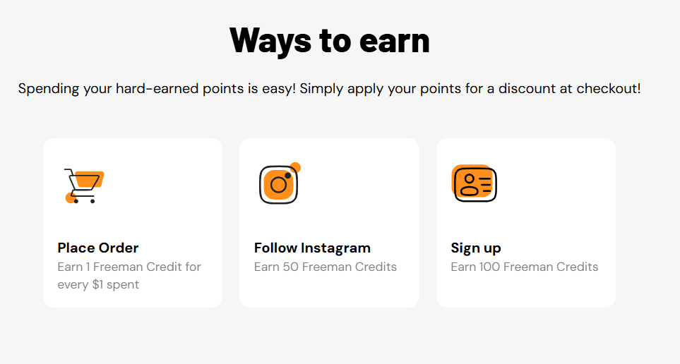
Reward structure
A reward structure was designed to reinforce meaningful behaviors across the customer lifecycle, such as account creation, purchases, and referrals rather than relying on discounts alone.
By aligning rewards with actions that drive long-term value, the program encourages early engagement, repeat purchases, and brand advocacy while remaining simple and easy to understand.
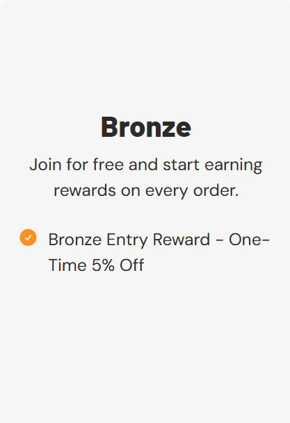
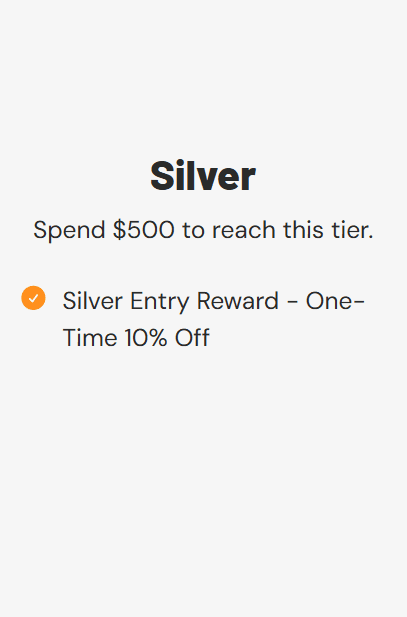
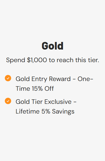
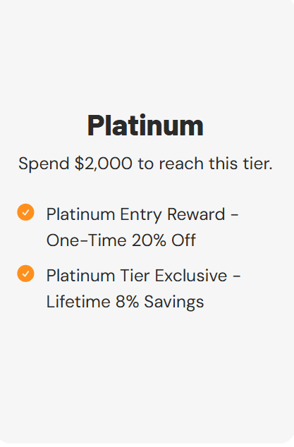
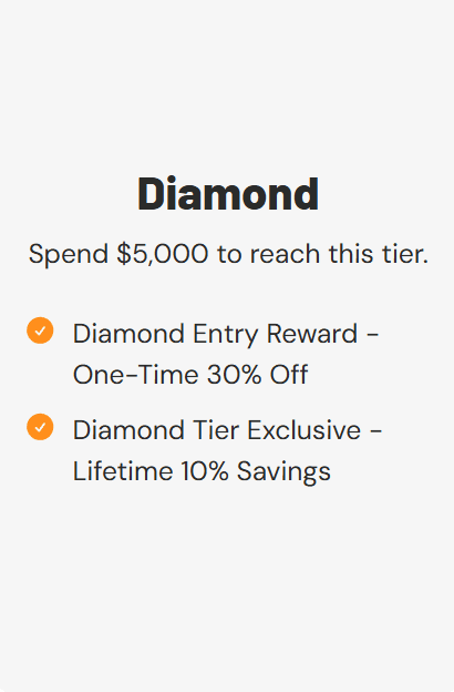
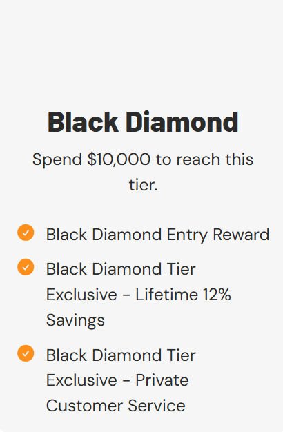
Tiered Loyalty Levels
A tiered loyalty system was introduced to reward ongoing commitment and give frequent buyers a clear progression path over time.
Each tier increases perceived value through incremental benefits, encouraging customers to consolidate spend with Freeman and strengthening long-term retention without heavy promotional pressure.
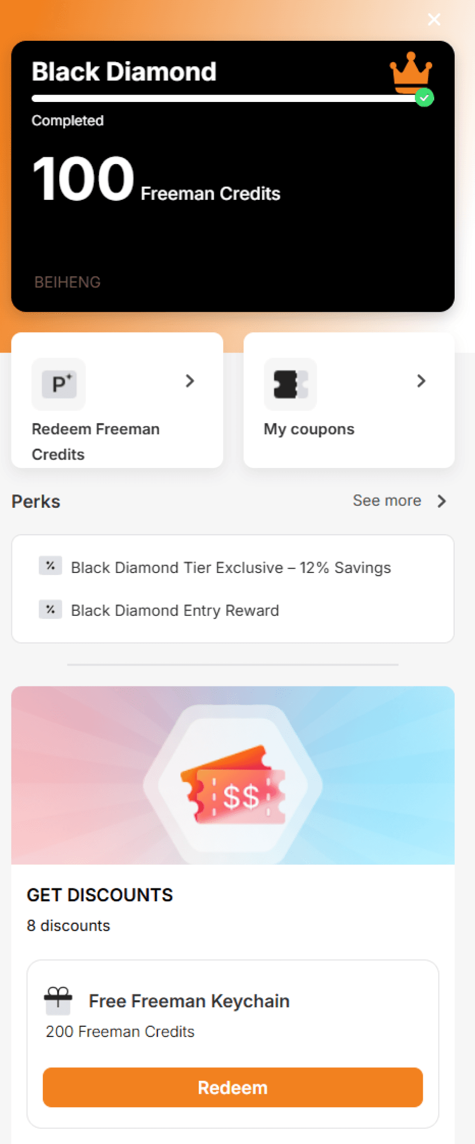
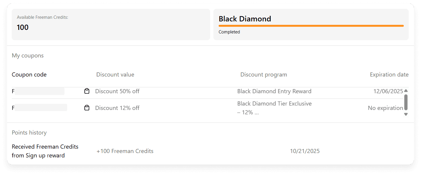
Membership pop-up & Loyalty Dashboard
A lightweight entry point and centralized dashboard made loyalty status and rewards easy to understand, reinforcing progress and encouraging repeat engagement.
Discovery: Introduces membership benefits at the right moment
Clarity: Centralizes points, tiers, and rewards in one place
Motivation: Makes progress and value visible over time
Pop-up Window
Dashboard UI
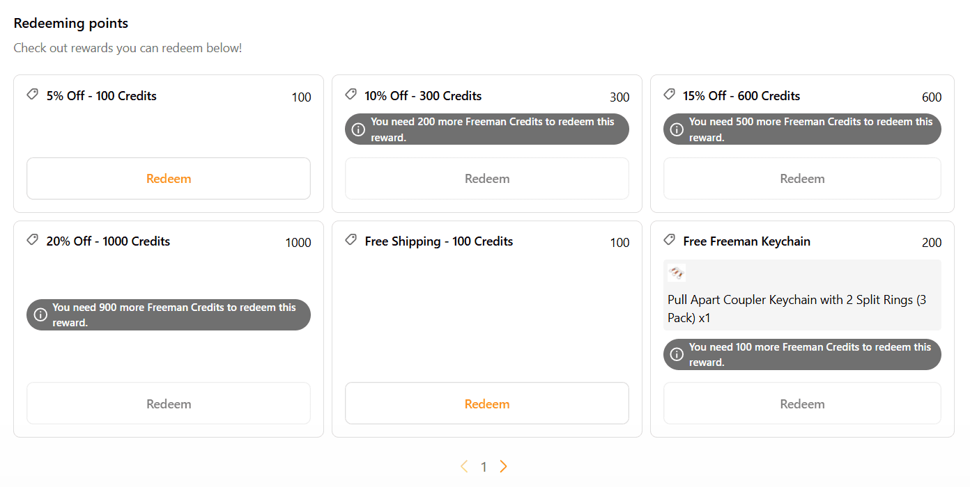
How rewards are redeemed
Rewards are accessible directly from the user’s profile, with clear redemption options based on available points.
Tier-exclusive discounts are automatically applied at checkout, ensuring eligible benefits are never missed and reducing cognitive load at the point of purchase.
User Profile
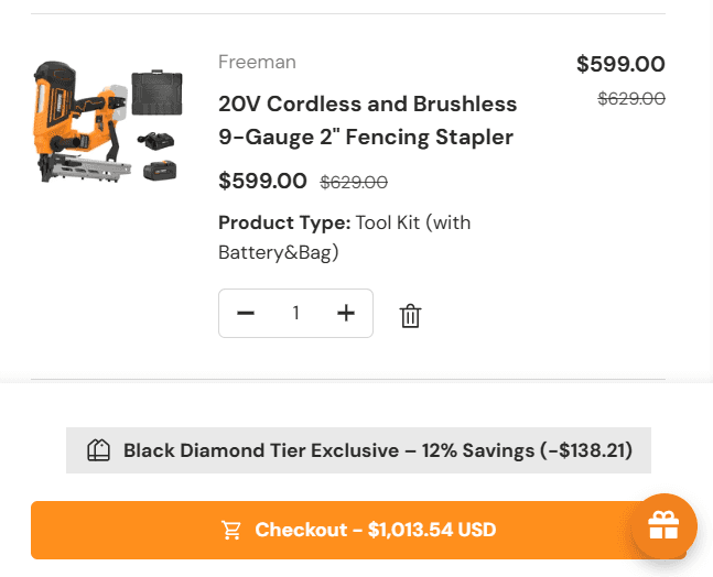
Cart
Result (30 Days Data)
Returning Customer Rate
19.98%
274%
Remaining Challenge: Low Loyalty Program Coupon Redemption & Engagement
What happened:
While loyalty sign-ups increased significantly after launch, a large portion of members were not actively redeeming rewards or engaging with the program benefits.
Why this likely happened: Redemption mechanics were not obvious or easily discoverable, users rarely visited their profile or loyalty dashboard, limiting awareness of available rewards, and the value of points and how to use them was not reinforced at key moments in the journey.
Signals of Success
Returning customer rate increased after launching the loyalty program.
Overall sign-up rate was higher than before the program existed.
The program showed early signals of retention impact, despite low engagement depth.
Next steps
Introduce time-bound or seasonal incentives (e.g. limited-time coupons or free items) to create urgency.
Surface rewards more prominently at high-intent moments (cart, checkout, post-purchase).
Continue monitoring engagement data as the program matures to validate long-term impact.
Reflection
This redesign significantly improved conversion, and average order value by reducing friction across product discovery, selection, and checkout. More importantly, it validated that meaningful growth in DTC isn’t driven by isolated UX improvements, but by aligning product design with pricing strategy, merchandising, and post-purchase experience.
Looking Ahead
Next, I’m focused on improving retention and lifetime value by better connecting product, marketing, and customer support.
On the product side, I’m continuing to refine navigation, filters, and compatibility guidance so customers can find the right tools faster and with more confidence. In parallel, I’m partnering closely with marketing and CSM teams to strengthen post-purchase touchpoints and bring in higher-quality traffic through more effective PPC and lifecycle channels.