I always read reviews before deciding to buy tickets for a show, so having a platform that provides comprehensive and honest reviews from real audience members would be really helpful.
RESEARCH · PRODUCT DESIGN · MVP
A great night.
A simpler way in.
Less searching. More certainty.
A Broadway ticketing experience
built around the next decision.
NeXT SCENEDISCOVER / DECIDE / TAKE YOUR SEAT
YOUR NEXT GREAT NIGHTADMIT
ONE.
ONE.
ACT
01EXPERIENCE
Broadway↗
01EXPERIENCE
Broadway↗
A FIRST RELEASE, BUILT TO LEARN.Explore the case study ↓
From show discovery
to the theater door.
As the sole designer, I worked with the founder and two engineers to shape a lean ticketing MVP for NeXT SCENE, an immersive entertainment company.
00 / THE CHALLENGE
Make the night out easier.
Broadway fans love live theater, but high ticket prices and limited access to reliable discounts often make attending shows stressful or unaffordable.
Finding a good deal usually requires searching across multiple platforms, waiting for last-minute offers, or relying on luck, turning what should be an exciting experience into a frustrating one.
Show lovers need a simple, trusted way to discover and purchase discounted Broadway tickets without the hassle or uncertainty.
15
User interviews
LISTEN BEFORE BUILDINGFour needs. One clear direction.
I want a platform that makes it easy for me to find and purchase tickets for my favorite shows, without having to navigate through confusing menus or complicated checkout processes.
I'm always looking for the best deals and discounts, so a platform that offers competitive pricing and exclusive promotions would be ideal for me.
It's important for me to have access to a wide variety of shows, including both popular productions and more niche offerings.
THE MVP BOUNDARY
A lean first release, built to learn.
This is a 0→1 product, so based on our research, we focused on building a lean MVP with only the most essential features.
The goal is to test market demand, validate assumptions, and gather user feedback to guide future iterations.
Research context +
As a newcomer to the Broadway ticketing space, we reviewed competitor platforms to understand how tickets are discovered, priced, and purchased.
01 / EXPLORATION
Find the simplest path to a seat.
To explore the solution space, I focused on rapid ideation and low-fidelity concepts that emphasized clarity, speed, and ease of purchase. Multiple layout and flow directions were tested to identify the simplest path from show discovery to checkout.
THE JOURNEY / FROM DISCOVERY TO ENTRY
One night. A clear way through.
01 / DISCOVERY
Three ways in. One destination.
Landing page
→→Show details
02 / DECISION
Keep the next action close.
Show details
→Buy
→Select date
03 / SELECTION
Build the ticket around your plans.
Select dateList view / Calendar view
→Select time
→Select seat
→Edit quantity
04 / CHECKOUT
From a purchase to a night out.
Buy ticket
→Contact information
→WeChat Pay
→Confirmation
View the original flow diagram +
To clarify the end-to-end experience, I created a main user flow that maps the key steps from show discovery to ticket purchase. This flow highlights how users move between browsing, selecting a show, and completing checkout, ensuring a smooth and intuitive path with minimal friction.
From low-fidelity sketches to the first release +
To quickly align with stakeholders, I created a low-fidelity prototype that focused on core screens and key interactions. These sketches helped communicate the concept, validate the main user flow, and gather early feedback before moving into higher-fidelity designs.
Once the concept was approved by the founders, I moved into high-fidelity design, incorporating all essential features.
02 / DISCOVERY
The excitement starts before the show.
A clear invitation to explore.
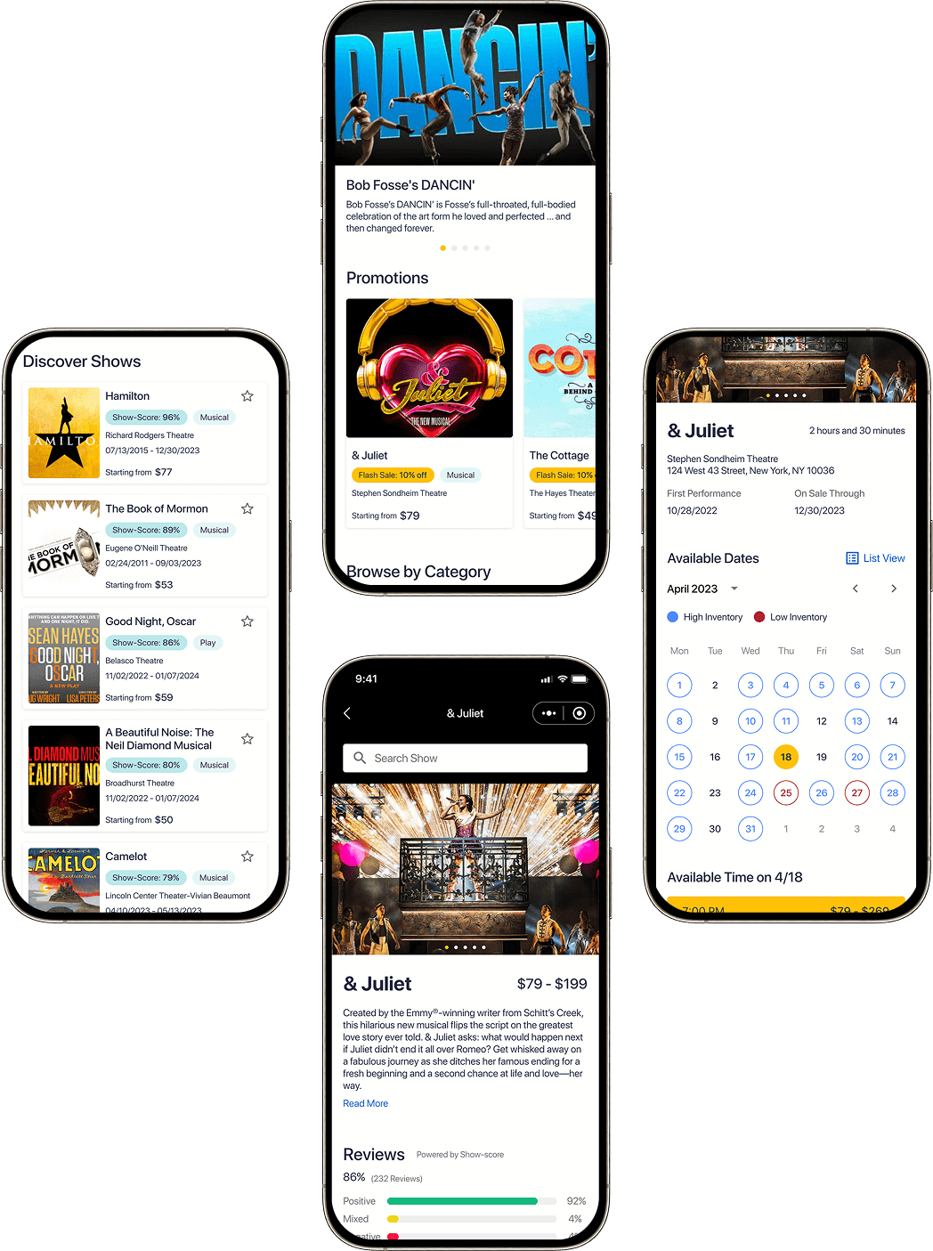
I designed the landing page to help users quickly discover shows and understand ticket value at a glance.
Prioritized clear hierarchy, featured promotions, and intuitive navigation to reduce friction in early decision-making.
Focused on guiding users from discovery to show details with minimal cognitive load.
A reason to look closer.
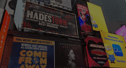
Synchronized with Broadway Inbound, giving users a comprehensive view of the current trends in the industry.
This will allow users to stay up-to-date with the latest shows, and make informed decisions about which shows to attend.
BROADWAY GUIDE
For regulars.
And first-timers.
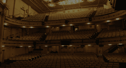
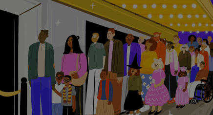
This section provides users with updated information on shows they're interested in. As well as guidance for newcomers on what to do before watching shows.
ORIGINAL PRODUCT UI
Weekly promotions
Make discounted pricing and current offers easy to scan.
& Juliet
Stephen Sondheim Theatre
Starting from $79 $69
The Cottage
The Hayes Theater
Starting from $49 $45

Aladdin
New Amsterdam Theatre
Starting from $58 $48
Back to the Future
Winter Garden Theatre
Starting from $69 $58
Bob Fosse's DANCIN'
Music Box Theatre
Starting from $39 $35
Swipe or use the arrows05 CARDS · ORIGINAL DESIGNS
Browse with a purpose.
Personalized discovery: Users can filter shows by genre and receive recommendations based on past purchases and browsing behavior, helping them quickly find relevant shows.
Information-rich cards: Each show card surfaces key details: title, genre, venue, date, time, and starting price, with the option to save shows for future reference.
Confidence before commitment.
Designed the show details page to help users quickly decide whether to purchase.
Highlighted pricing, promotions, ratings, and venue details to reduce uncertainty.
Build confidence before purchase: Clear show descriptions, images, and Show-Score reviews help users understand what to expect and assess show quality quickly.
Support planning and decision-making: Key details like location, duration, performance dates, and on-sale timelines help users plan their visit with confidence.
ORIGINAL PRODUCT UI
Related news
Keep the context around a show within reach.
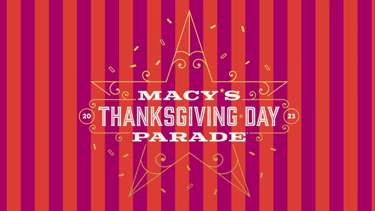
Catch These Broadway Performances at the Macy's Thanksgiving Day Parade

New Cast Members Join & Juliet
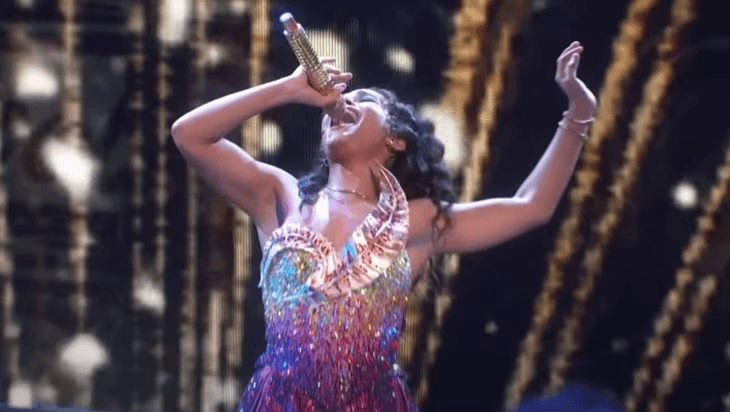
Video: & Juliet Performs at the 76th Annual Tony Awards®
Swipe or use the arrows03 CARDS · ORIGINAL DESIGNS
ORIGINAL PRODUCT UI
Similar shows
Keep discovery moving when a visitor is not ready to commit.

Aladdin
New Amsterdam Theatre
Starting from $58
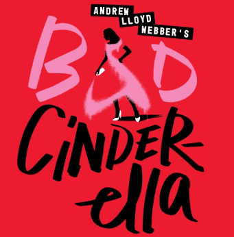
Andrew Lloyd Webber's Bad Cinderella
New Amsterdam Theatre
Starting from $35
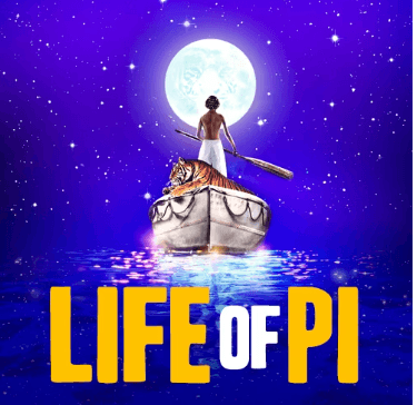
Life of Pi
Gerald Schoenfeld Theatre
Starting from $79
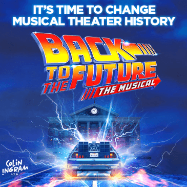
Back to the Future: The Musical
Stephen Sondheim Theatre
Starting from $79
Swipe or use the arrows04 CARDS · ORIGINAL DESIGNS
03 / CHECKOUT
From a promising show to a ticket in hand.
A streamlined checkout flow that guides users from date and seat selection to payment and ticket access.
FOLLOW THE PURCHASE JOURNEY
One decision at a time.
Original seat-section highlight +
Watch the complete original checkout flow +
04 / ITERATION
Small changes. Clearer decisions.
To better serve our users and understand the problem, I conducted rounds of lightweight usability testing.
Ease of use
Reduce confusion in navigation and task completion.
Clear information
Make the next decision easier to understand.
Purchase confidence
Help visitors recognize value and keep moving.
BEFORE → AFTER
Make the savings visible.
The revised card shows the original and discounted prices together.
Original price treatment
& Juliet
Stephen Sondheim Theatre
Starting from $79
Revised price comparison
& Juliet
Stephen Sondheim Theatre
Starting from $79 $69
BEFORE → AFTER
Make discovery easier to scan.
The revised list format supports scanning and saving shows for later.
Original carousel card
Aladdin
New Amsterdam Theatre
Starting from $58
Revised list card with save action
Aladdin
New Amsterdam Theatre
07/13/2015 – 12/30/2023
Starting from $58
The purchase is only the beginning.
Clear confirmation and access: Redesigned the order confirmation with an interactive ticket card that highlights key details and provides quick access to the ticket wallet.
Encourage continued engagement: Improved layout readability and updated the CTA to “Discover More Shows” to prompt further exploration after purchase.
Plan around the place.
Location-based discovery: The map view helps users quickly find shows near their current location, making it easier to plan based on distance and convenience.
Seamless exploration: Users can browse nearby and saved shows directly from the map, bridging discovery and decision-making without switching contexts.
05 / REFLECTION
Designing the first act.
Build the essential.
Learn from the real.
Building a platform from scratch can be a complex and challenging task, and each design decision made can have a significant impact on the product's overall performance.
I am grateful to have had the opportunity to work on a product in its early stages, as it allowed me to develop my skills in making informed design decisions and thinking more strategically about the product roadmap.
This experience has provided me with valuable knowledge and experience that I can apply to future projects and has made me a more well-rounded product designer.
NEXT SCENE / CASE STUDYEvery great experience
Every great experience
starts before the curtain rises.
0 → 1
RESEARCH · DESIGN · ITERATION